User Guide & Overview
@wcomp/elementum is an ultra-lightweight, zero-dependency design system of 109 accessible Web Components. It combines fine-grained signal reactivity with standard W3C Web Component APIs, 1:1 Penpot/Figma design tokens, and built-in MCP & AG-UI protocol support.
0 third-party runtime packages. It runs natively in modern browsers, Node.js (SSR), and within React, Vue, Svelte, Angular, Solid, or vanilla HTML without build step locks.
Fine-grained reactive updates directly mutating text nodes and attributes without virtual DOM diffing.
Bidirectional sync with free open-source Penpot (DTCG standard) and Figma Variables.
Full keyboard navigation, roving tabindex, focus management, and screen reader announcements.
Built-in Model Context Protocol server eliminates hallucinations during agent generation.
Installation & Setup
Install via npm or use drop-in ES modules via CDN:
1. Direct Script Tag (Zero Build)
2. Framework Integration (React / Next.js, Vue, Svelte)
Because Elementum elements are standard custom elements with Form-Associated Custom Elements (FACE) support, they work out of the box with standard props and event listeners.
Theming & CSS Custom Properties
All component styles are driven by CSS custom properties defined in src/tokens.css. Changing a token updates all components instantly across both Light and Dark modes.
Developer Architecture
Elementum avoids the bloat of traditional component libraries by replacing heavy virtual DOM runtimes with a ~2KB standard Signal micro-kernel.
Micro-Signals Kernel
Elementum ships a zero-dependency reactive micro-kernel built around signal(), computed(), effect(), and isSignal().
Unlike virtual DOM diffing, signal subscriptions track exact getters lazily at runtime and update only the affected DOM text nodes, attributes, or callbacks when values change via !Object.is(prev, next).
1. Core Reactive Primitives
2. Complete Signals API Reference
| API / Member | Signature | Behavior & Lifecycle Notes |
|---|---|---|
signal(initialValue) |
Signal<T> |
Creates a writable reactive container initialized with initialValue. |
sig.value |
T (get / set) |
Reading inside computed() or effect() subscribes the outer computation. Writing notifies subscribers only when !Object.is(prev, next). |
sig.peek() |
() => T |
Reads the underlying value without subscribing the currently running effect or computed. |
sig.subscribe(cb) |
(cb: (val: T) => void) => () => void |
Invokes cb(sig.value) immediately and on subsequent updates; returns a disposal function to unsubscribe. |
computed(getter) |
Computed<T> |
Creates a lazy, memoized derived signal (subclass of Signal). Marks itself dirty when upstream signals change and recomputes only when .value is read. |
effect(fn, options?) |
(fn, { signal?: AbortSignal, onError?: (err) => void }) => () => void |
Runs fn() immediately, tracks all signals read during execution (cleaning up stale dependencies on each re-run), isolates exceptions via optional onError, and disposes via returned handle or AbortSignal. |
batch(fn) |
<T>(fn: () => T) => T |
Coalesces multiple signal writes into a single atomic notification pass while keeping computed() reads fresh inside the batch. |
asyncSignal(fetcher, opts?) |
AsyncSignal<T> |
First-class async reactive primitive with automatic dependency tracking, AbortSignal race-condition cancellation, stale-while-revalidate .value, .pending, .status, structured .error details, .refetch(), .abort(), .mutate(), and .read(). |
isPending(source) & NotReadyError |
(AsyncSignal | () => unknown) => boolean |
Inspects pending state of an AsyncSignal or derived getter calling .read() without crashing on NotReadyError. |
isSignal(value) |
(val: unknown) => boolean |
Returns true for Signal, Computed, and AsyncSignal instances (val instanceof Signal). |
| Coercion & String Helpers | valueOf(), toString(), [Symbol.toPrimitive], .length, string methods |
Supports reactive expression reads like Number(count) and string methods (toUpperCase(), toLowerCase(), trim(), slice(), substring(), includes(), indexOf(), startsWith(), endsWith()). |
2b. Async Signals, Batching & Error Details
asyncSignal() tracks synchronous signal reads inside your fetcher, cancels stale in-flight requests via AbortSignal when inputs change, preserves the last resolved .value during refreshes (no visual tearing), and exposes structured error details (message, name, cause, status, timestamp, attempt):
3. Three-Way Component Property & Attribute Reactivity
The Elementum base class wires together HTML attributes, JavaScript property assignment, and internal signals so external scripts and frameworks can interact using whichever style they prefer:
formAssociated controls (such as <el-input>, <el-select>, <el-switch>), live value and checked changes intentionally do not overwrite the host HTML attribute so formReset() always restores the initial HTML default. Non-null object/array signals (such as el-table or el-autocomplete data) stay in JS state without stringifying onto HTML attributes.
4. Authoring Custom Components with Signals & Template Bindings
Inside custom Elementum subclasses, declare observedAttributes alongside signal() fields and wire reactive bindings in render():
${this.count}) or a getter function (${() => this.count.value}). Evaluating ${this.count.value} directly outside an arrow function unwraps the value once at initial render and will not stay reactive.
Single-Page Applications (SPA) & Declarative Router
Elementum provides native, zero-dependency SPA routing powered by <el-router>, <el-route>, <el-route-link>, and micro-signals.
You can build complete client-side applications with view transitions and browser history support without React Router, Vue Router, or bundlers:
Combined with signal() and computed(), state is shared across all routes effortlessly. See the full live implementation in the Pulse Cloud Showcase App.
Declarative Shadow DOM (DSD) Server-Side Rendering
Elementum components support native Declarative Shadow DOM (DSD), allowing server rendering without client hydration flash (FOUC):
Run the zero-dependency Node.js SSR server (npm run ssr → http://localhost:3333/?hydrate=0 for pure Zero-JS DSD vs ?hydrate=1 for progressive hydration), or inspect the pre-rendered Live DSD SSR Demo (source: examples/ssr-server.js).
Form-Associated Custom Elements (FACE)
All input primitives (<el-input>, <el-select>, <el-slider>, <el-checkbox>, <el-radio>) implement the native browser ElementInternals API:
- Participate automatically in native
<form>submission viaFormData. - Support native validation reporting with
setValidity(). - Handle form reset events cleanly via
formResetCallback().
Headless Behaviors, Agent Runtime & Testing Contracts
Every Elementum component supports opt-in unstyled mode, and its underlying interaction, motion, agent, and WAI-ARIA testing primitives are exported as standalone zero-dependency subpaths:
@wcomp/elementum/behaviors— 16 composable primitives:createPressBehavior,createRovingFocus,createDismissableLayer,createFocusRecovery,createShortcuts,createDisclosureBehavior,createPopupPositioner,createPresenceBehavior,prefersReducedMotion,createSelectionBehavior,createReorderBehavior,createHistory,highlightMatch,announce,setHostState, andisRTL.@wcomp/elementum/agent— Shadow-DOM-piercingsnapshot(root),act(root, cmd, { guard }), andregisterWebMCP(root)for AI agents operating live interfaces.@wcomp/elementum/testing— Reusable WAI-ARIA APG (checkAriaPattern), provider-free RTL (checkDirection), and DSD SSR (checkServerRender) contract validators.
MCP Server Setup Guide
Elementum includes a built-in Model Context Protocol (MCP) server (mcp/server.js).
It exposes the entire design system's schema, token values, and component constraints directly to AI coding agents like Google Antigravity, Claude Code, Cursor, and Gemini CLI.
Connecting to Google Antigravity & Claude Code
Add the following configuration to your MCP settings file (e.g., ~/.gemini/antigravity/mcp_config.json or claude_desktop_config.json):
Available MCP Tools
Returns all 109 available Web Components with descriptions and categories.
Returns exact attributes, slots, events, and CSS shadow parts for any tag.
Exposes all design tokens (colors, radii, spacing, elevations) for consistent styling.
Produces accessible, compliant HTML snippets according to design standards.
Example AI Prompt
AG-UI Protocol & Agentic Frontends
Elementum includes a zero-dependency adapter (createAgUiStore, applyJsonPatch, getByPointer) and the <el-tool-call> Web Component to connect AG-UI (Agent–User Interaction Protocol) event streams directly to reactive DOM components.
mcp/server.js) to give agents design-system schemas at build/prompt time, and use AG-UI (createAgUiStore) to stream live reasoning, text deltas, tool calls, and RFC 6902 state patches into Elementum components at runtime without virtual-DOM re-render cascades.
1. Event-to-Component Mapping
| AG-UI Event Type | Elementum Store State | Bound Component Effect |
|---|---|---|
RUN_STARTED / RUN_FINISHED / RUN_ERROR |
status, runId, error |
Toggles loading on <el-prompt-input> and stops streaming cursor on completion. |
STEP_STARTED / STEP_FINISHED / THINKING_* |
thinking, stepName, thinkingText |
Animates <el-reasoning-card> pulse indicator and updates current step summary. |
TEXT_MESSAGE_START / CONTENT / END |
currentText, messages |
Appends streaming chunks live into <el-streaming-text> without resetting typing state. |
TOOL_CALL_START / ARGS / END / RESULT |
toolCalls |
Streams JSON arguments, completion results, and HITL approval state into <el-tool-call>. |
STATE_SNAPSHOT / STATE_DELTA |
state, pathSignal(pointer) |
Applies RFC 6902 JSON Patches and updates any bound component prop (e.g. <el-number-flow>, <el-chart>). |
2. Connecting an AG-UI SSE Stream & State Bindings
3. Tool Calls & Human-in-the-Loop (HITL) with <el-tool-call>
When an agent starts a frontend or sensitive backend tool with requiresApproval: true, <el-tool-call> renders formatted JSON arguments alongside Approve Execution and Reject controls, emitting bubbling approve and reject events.
Try the live interactive AG-UI event streamer and HITL <el-tool-call> sandbox in the AI Agent Studio.
Figma & Penpot Workflow
Design-to-code drift is eliminated with a bidirectional W3C Design Tokens Community Group (DTCG) workflow connecting Penpot (free & open source, design.penpot.app) and Figma directly to src/tokens.css and all 105 Elementum Web Components.
Create or open your design file at design.penpot.app and connect the Penpot MCP Plugin.
Browse community UI kits at penpot.app/libraries-templates or read the full Penpot Workflow Guide.
Penpot MCP Design System Sync (Code → Penpot)
Elementum includes tools/sync-penpot-mcp.js (npm run penpot:mcp), which connects directly to the Penpot MCP HTTP stream (https://design.penpot.app/mcp/stream?userToken=<YOUR_TOKEN>) to generate the entire Elementum Design System inside your open Penpot file.
userToken JWT into source control or public docs. Pass it at runtime via PENPOT_MCP_URL / PENPOT_MCP_TOKEN environment variables or CLI flags.
1. Connect & Run the Synchronizer
- Open or create a design file in Penpot.
- Open the Penpot MCP Plugin inside the file so your browser session is actively connected, and copy your MCP stream URL or
userToken. - Run the synchronizer from your workspace root:
2. CLI Options & Generated Penpot Assets
| Flag / Asset | Details |
|---|---|
--url / PENPOT_MCP_URL |
Full Penpot MCP HTTP stream endpoint (hosted https://design.penpot.app/mcp/stream?userToken=... or self-hosted). |
--token / PENPOT_MCP_TOKEN |
Penpot MCP userToken; automatically builds the hosted design.penpot.app/mcp/stream URL. |
--dry-run |
Validates token & component generation payloads locally and prints counts/byte sizes without network calls. |
| Generated Page & Tokens | Creates page Elementum Design System with 54 W3C DTCG tokens across 3 sets (Elementum Core active: 9, Elementum Light active: 28, Elementum Dark: 17) and 28 library colors. |
| Generated Components | Creates 105 Master Components across all 8 categories (Actions & Buttons, Forms & Inputs, Data Display, Feedback & Status, Overlays & Dialogs, Navigation, Layout & Primitives, AI & Specialist) on non-overlapping boards. |
Penpot → Elementum Case Study: LedgerFlow
To prove the full Design → MCP → Web Components pipeline, LedgerFlow was designed in Penpot using el-* annotated boards and compiled directly into a live, zero-dependency app via tools/penpot-to-elementum.js (15 validated Elementum components, 0 unknown tags).
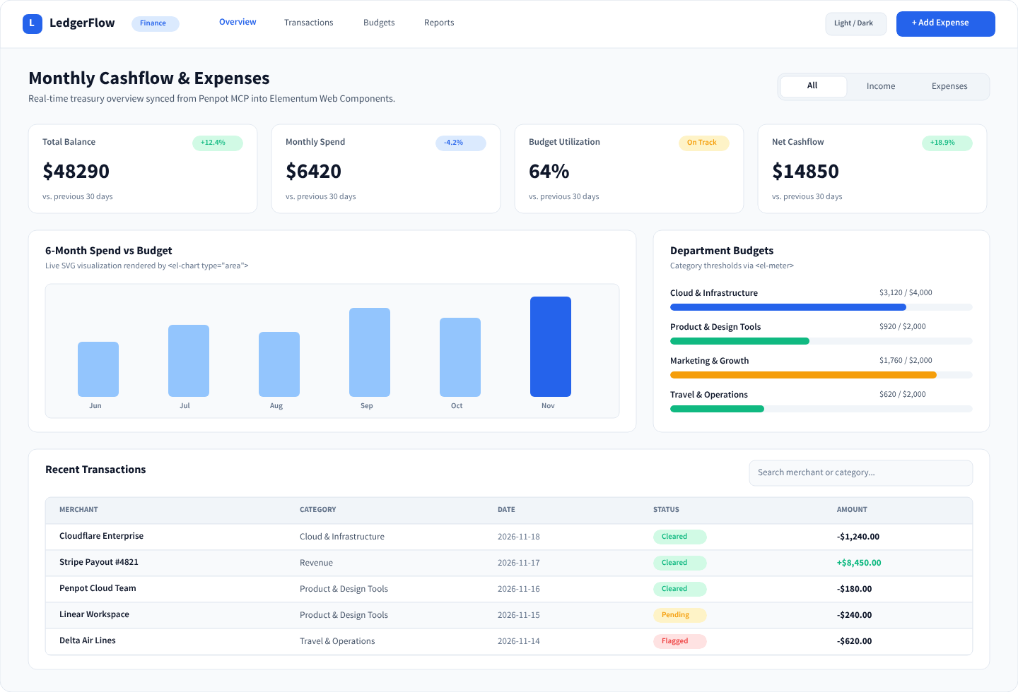
Example / LedgerFlow App) via MCP export_shape.
View in Penpot ↗
Open Live Generated App →
Penpot / Figma → Code Token Compiler
- Design in Penpot / Figma: Edit brand colors, radius scales, and elevations in your design file.
- Export Tokens: Export W3C DTCG JSON to
tokens/penpot-tokens.json. - Run Token Compiler: Run
npm run tokens:syncto compilesrc/tokens.css.
The compiler automatically derives high-contrast Dark Mode tokens, translucent borders (--el-border-translucent), and layered ambient elevation shadows (--el-shadow-card).
How to Contribute
We welcome contributions to Elementum! To maintain world-class reliability, all contributions must uphold our three core engineering pillars:
- 0 Runtime Dependencies: We do not add third-party runtime dependencies. Everything is written on standard browser platform APIs.
- 100% Green Test Suite: Every feature must have unit tests in
test/. - ≥ 95% Line Coverage Bar: Run
npm testto ensure project coverage exceeds 95%.
Scaffolding a New Component
Use our automated generator CLI: